A catalogue this size.
More than design.
For 20 years, I helped develop one of Langstane’s largest and most complex pieces of annual communication.
Thousands of products. Hundreds of pages. Product data, imagery and print production, all brought together in a catalogue customers could find their way around.
- Client
- Langstane
- My role
- Design / Data setup / Image preparation
- Period
- 2004–2024
- Format
- Annual printed catalogue
01 / The scale
Pages. One catalogue.
2016 edition · page count stated in its introduction
The first edition in 2004 had 409 pages. By 2016, the catalogue’s introduction described a 692-page publication: a much larger product range, but still something a customer needed to use with confidence.
The job wasn’t simply to fill the pages. It was to organise the information, keep it consistent and make the products easy to understand.
02 / The system
A way in.
A way around.
The contents page makes the structure visible. Colour, section numbers, descriptions and page ranges work together so the reader can move from a broad category to the right part of the catalogue.
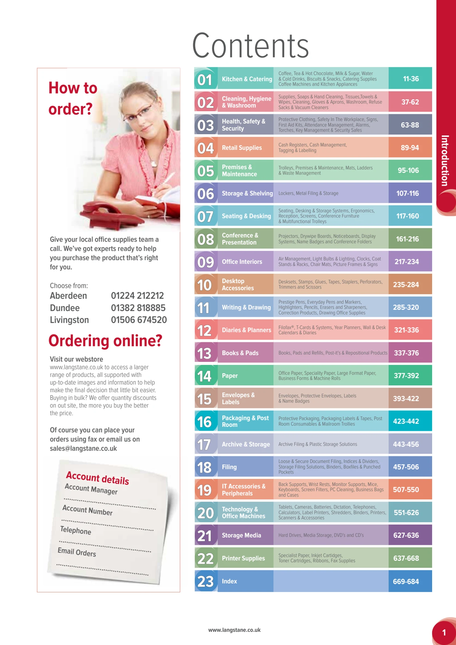
23 sections.
A consistent route.
I designed the contents and ordering-guide pages as part of the wider catalogue. The category colours and numbering connect the opening pages to the navigation used throughout.
The final section is the index, giving customers another way to locate a specific product.
Original 2016 artwork, shown without redesigning it for the portfolio.
Making the information readable
A visual language
for the small stuff.
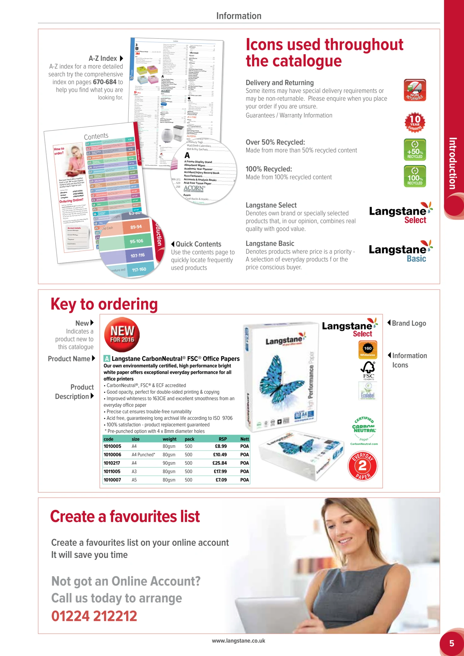
The ordering guide explains product names, descriptions, brand marks, codes, prices and information icons. It turns the repeated elements on a product page into something the customer can recognise.
This structure had to work across very different products—not just on one carefully chosen page.
03 / The detail
Thousands of
small decisions.
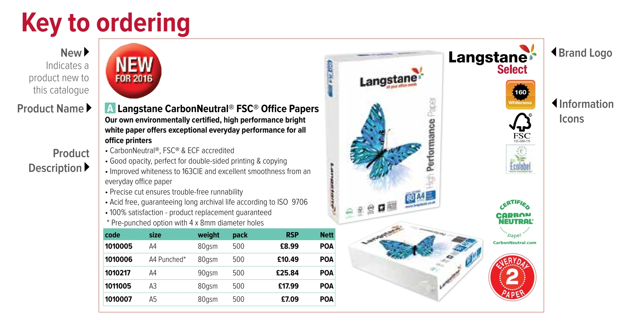
Product descriptions, options, codes, pack sizes and prices all need their place. This enlarged detail from the ordering guide shows the hierarchy at work.
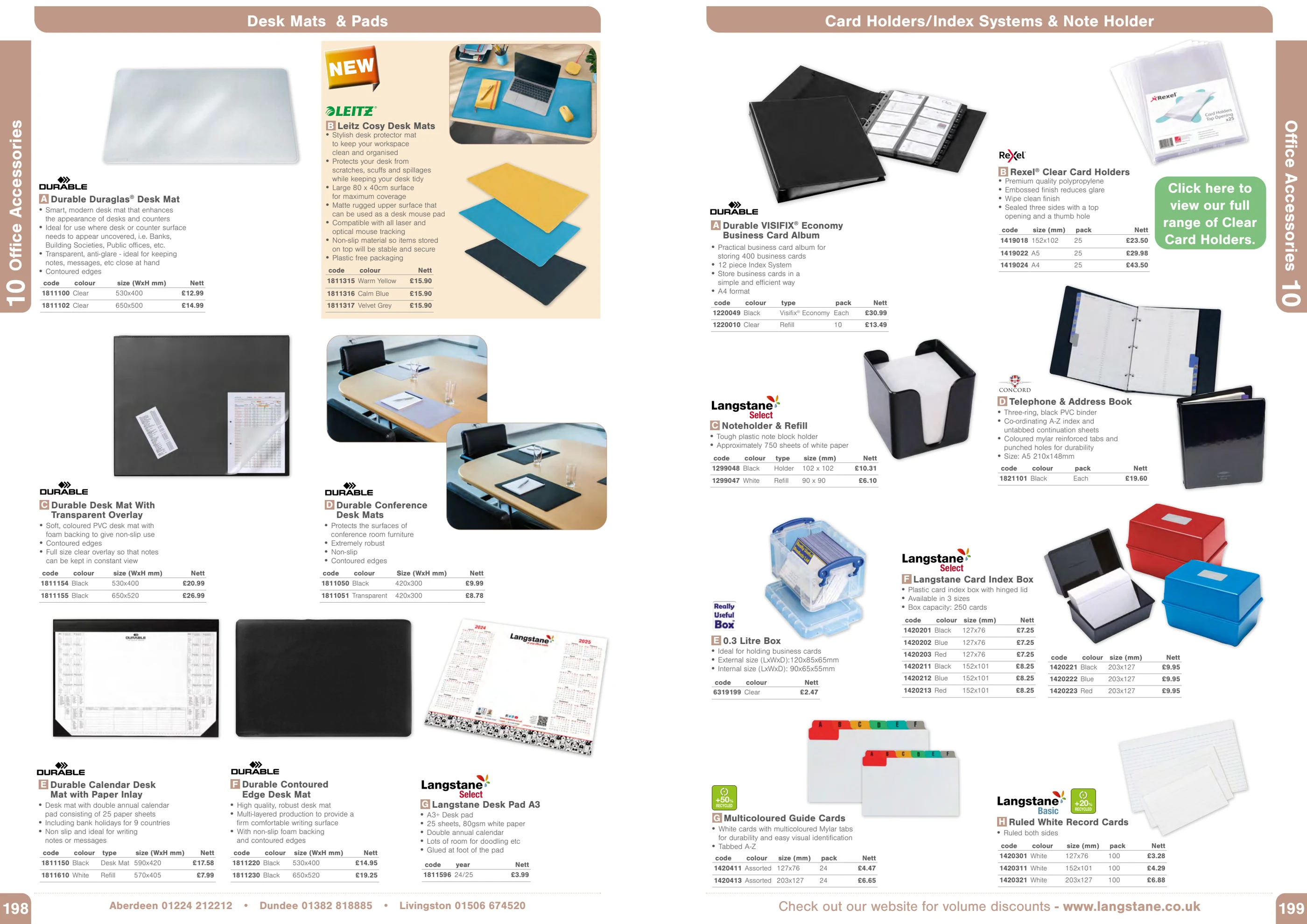
The everyday matters.
Office accessories bring the density of the catalogue into focus: multiple product families, colour options and pricing tables sharing the same spread.
Room for the product.
Seating needs space for form, features and configuration. The page structure supports larger imagery while keeping specifications and options close to the product.
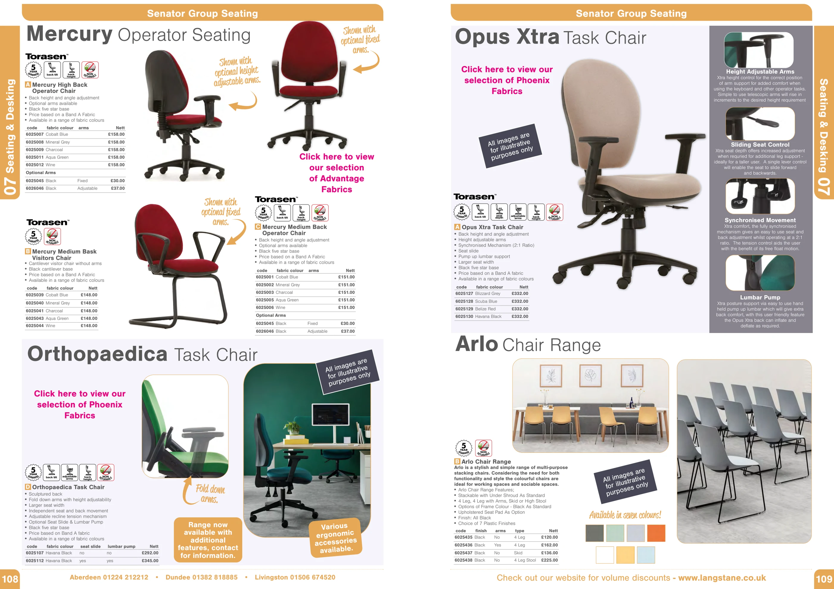
Not every page has the same job.
Product promotions can be more expressive. A service page needs to explain an offer. Both belong in the catalogue, without having to behave like a standard product listing.
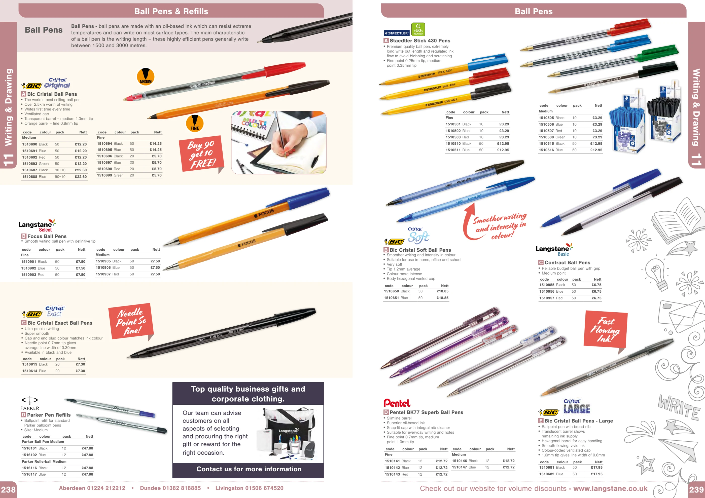
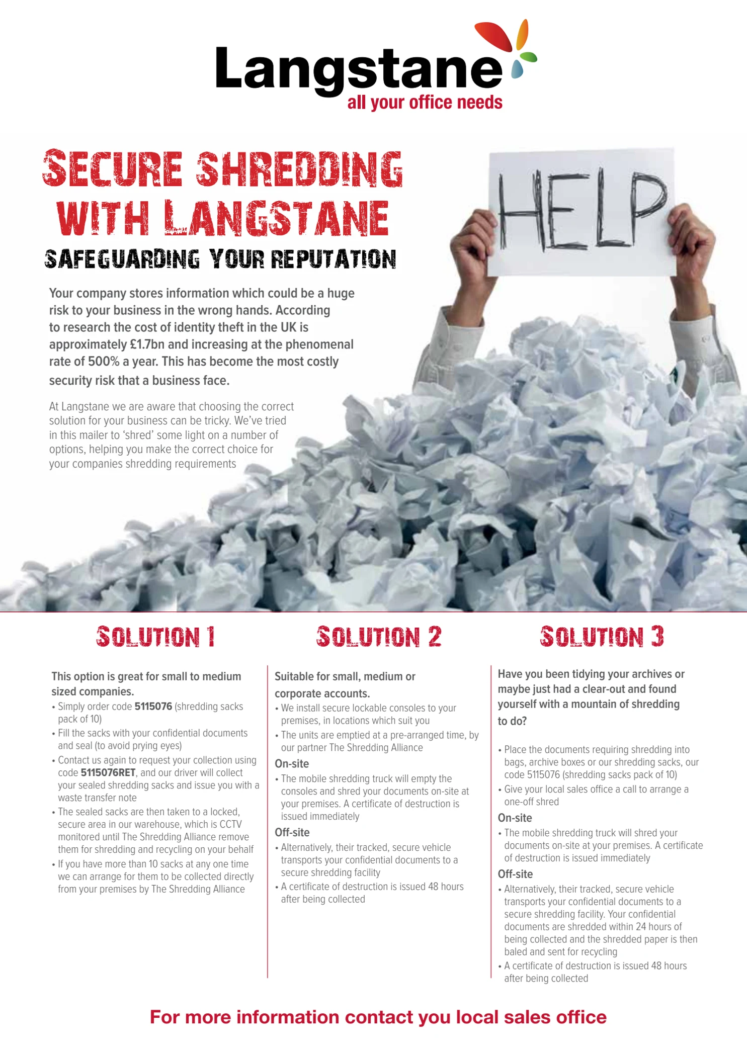
A service.
Not a stock list.
I designed this page around a clear headline, a strong image and three service options. It shows the editorial and promotional work sitting alongside the catalogue’s structured product information.
04 / The production
The data came in.
The design
still mattered.
The publishing setup brought product information and imagery into InDesign. It didn’t make the final layout decisions for me.
-
01
Select & collect
Procurement decided which products to include. The data went into the catalogue system, while our team gathered supplier descriptions and high-resolution images.
-
02
Connect & prepare
I set up the fields, templates and ODBC connections. Product codes linked images to the database. I handled the Photoshop work, including image checks and clipping paths.
-
03
Choose a starting point
We selected a template in the CMS: “4.0” meant four products with equal space; “4.1” gave the first product a larger hero position.
-
04
Lay out & refine
Once the content was in InDesign, I laid out the page. I built the master-page grids, paragraph and character styles, nested styles and GREP styles, refining them over the years.
How the setup evolved
Excel → FileMaker → Matrix
We started with Excel connected via ODBC to EasyCatalog in InDesign. Later, FileMaker gave us a two-way connection: changes in InDesign could update the data. Product codes, descriptions and prices came through the link. The final system we used was Matrix.
My responsibility grew with the project.
For the final three editions, I was the sole designer, supported at times by temporary production staff. That distinction matters: the design was my responsibility, within a wider process involving procurement, supplier information and production support.
05 / The evolution
Twenty years.
Always developing.
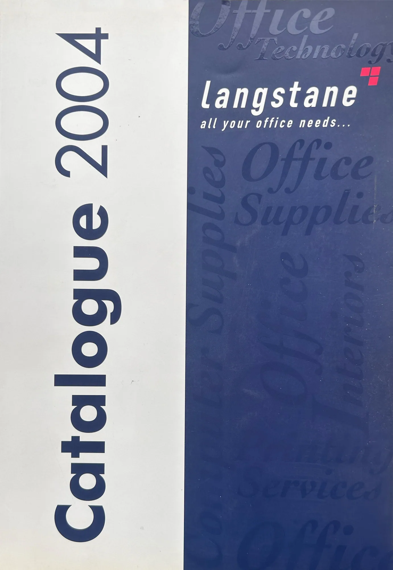
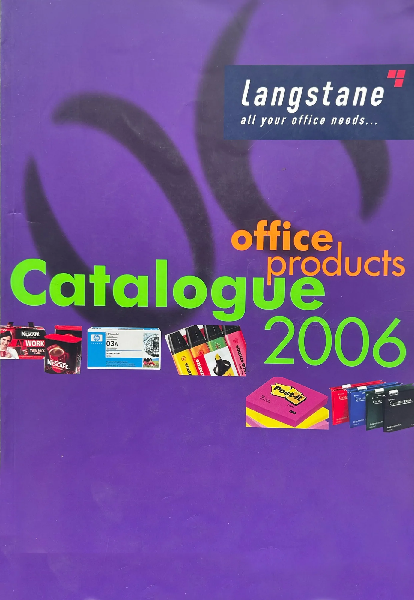
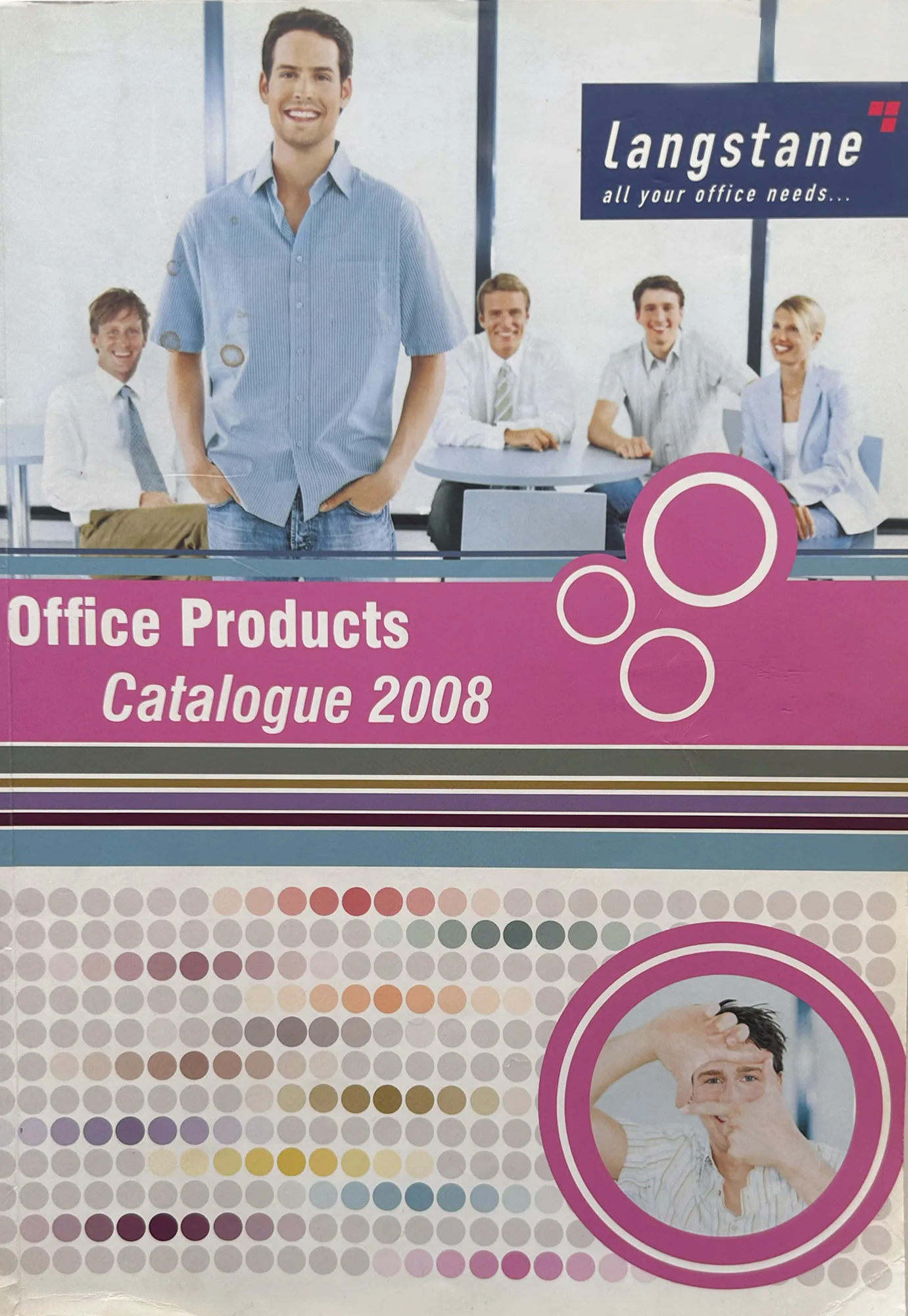
From the first edition in 2004 to 2024, the catalogue changed with the product range and the business. The covers show its visual evolution; the pages behind them show the design and production work that made it usable.



The bigger picture
Design judgement.
Production knowledge.
This project brought both sides of my background together: building the systems that supported a large publication, and making the individual design decisions that brought its pages to life.
Explore the Langstane design system ↗